Having lots of late-night thoughts as I’m familiarizing myself with the software. I’m having fun so far!
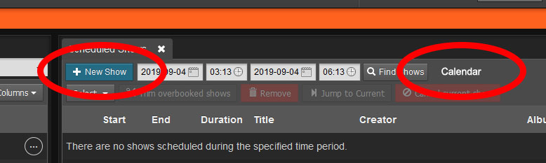
Could we add a “New Show” button to the Dashboard? Would be great to have it on the top of the “Scheduled Shows” section, just under the tab, near the date field. Then, have a new column spring up either to the right or left. If there’s not enough room, perhaps as a pop-up.
Also, want to save from having an unneeded menu item? Have “Calendar” as a button on the dashboard next to the “Find Shows” button and have it pop up on the same page. Makes more sense to have it there. Then this will really be a dashboard. 
Pop-up Calendar View:

Incidentally, the “New Show” panel on the Calendar page could probably stand to have a little more width allotted to it so the fields can line up evenly. I have my browser window set to take my entire monitor’s space, and it’s still not enough room.

Also, “Podcasts” and “My Podcast” … it’s not immediately clear what the difference was between those two buttons. “Podcasts” would probably be better described as “Podcast Episodes” but I realize there is a lack of column width to write that out, and “Episodes” might not describe it thoroughly enough.
“Analytics” might be more logical to place above “Settings.”
The Settings sub-menu… doesn’t really need to be there. All those items settings could be in the main menu as indented items, just like the ones under Dashboard are. In fact, if you do that, “My Podcasts” would make more sense to be placed under Settings, because those fields set up general details, just like the “General” settings page does. It sets up the feed details, etc. If we’re worried about space, perhaps an collapsible menus would be in order?
In the Help menu, could we have all external links open in new tabs?
“What’s New?” goes to the GitHub Releases page. I suppose that works, but maybe just call it “GitHub”?
“Get Help Online”… all of the help is online, technically. Should probably call it “Community Help”.
Do you think the station admin email should be prompted for during initial installation? I almost had a case of a lost password at the very beginning. Plus, I don’t know if this is a security issue, but we might want to have an email verification be sent. This would come in handy if LibreTime is being set up on a remote server as a Service / SaaS.